Market News:


Charts represent the road map for success in the Forex market, as most of the psychological behavior of the market is reflected in the charts, so we can use it to make guesses and expectations for what will happen to the currency pair in the future.
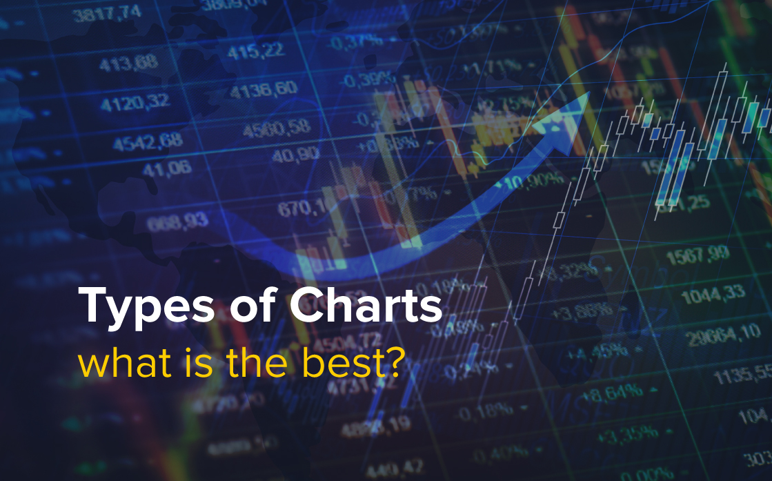
There are three types of charts:
1. Line Chart
2. Bar Chart
3. Japanese candlestick chart
A line chart is simply a line that connects the closes prices which finally shows up as a line on the chart displaying price levels on the vertical x-axis and the time and date on the y-axis, see the following example:
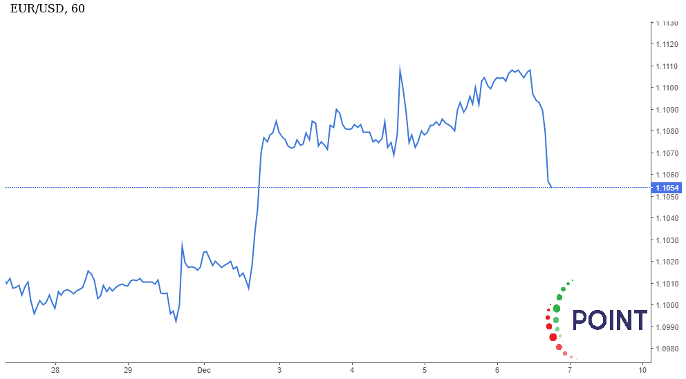
The line chart does not show any information about the opening price of the day nor does it show the highest or lowest price during the day.
The bar chart is the delivery of a set of bars together and each bar represents a trading movement for one trading session. It shows the price on the x-axis and the time and date on the y-axis are represented as their counterpart in the line graph. See the following example
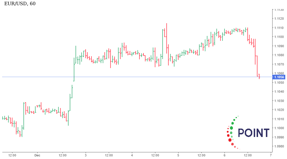
Each bar on the chart above shows us the price information for the trading session, as shown in the following figure:
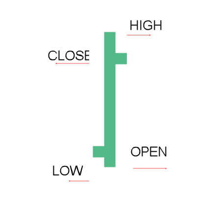
Bar charts give us these important things: (Open, High, low, and close) "OHLC". Each letter of them is denoted by an English word: opening and closing price, highest and lowest price.
Japanese candles charts provide the same information as bar charts. Just as "bar" represents price movement, "candle" also represents price movement during one trading session, and we will explain the difference between "bar" and "candle" through the following graph:
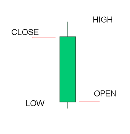
As you can see that the levels of opening and closing in the "bar" are in the basic structure of the "candle", and (the upper candle wick) represents the highest price in the day, and also (the lower candle wick) represents the lowest price on the same day.
As it is clear, the candle chart is the best way to display the price movement, because it contains colors that indicate the periods of ups and downs, and the periods of bullishness are often indicated by a white or colorless candle, and on the contrary, the black candle represents a bearish period of time.
Here is an example showing the candle chart, green candle represents the days that are bullish, and red candle represents the days of decline.
The candle graph has become the best choice for most traders around the world because it is clearer and richer in information on the direction and rise of the currency, levels of support, resistance and reflection points.
Get financial advice from Point Trader Group experts.
For free expert financial advice.