
Chapter 3 - Introduction to charts
Lesson 3.1 - Graphs Types and Components
Charts are the primary tool on which the technical analyst relies, and therefore the structure of charts must be clarified in more detail.
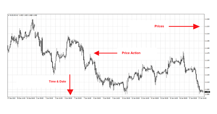
Looking at the following figure, you will be able to see that
- The vertical axis that represents the price scale.
- The horizontal axis that represents the timescale.
- The movement of prices is displayed in different ways, as it includes several data (opening price, closing price, highest price, lowest price).
The most popular bidding methods are:
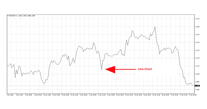
- Line Chart
- It is the simplest way to display quotes, as all data are reduced, and the graph relies on connecting closing prices in order to illustrate the price movement.
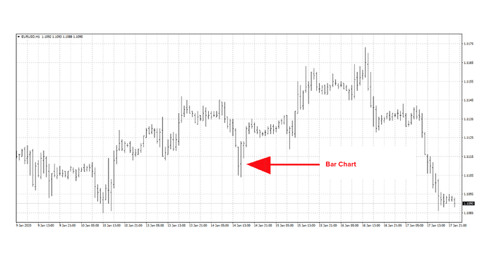
Price column
It is the most popular way to display price data (opening price, closing price, highest price, lowest price) at the Western School of technical analysis, but it retreats a lot in the face of the Japanese candlestick chart.
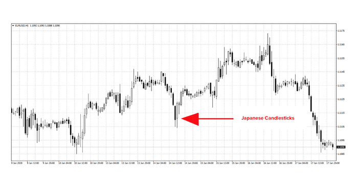
Japanese Candlestick Chart.
It is the most popular method of presenting quotes at the present time, and it is the Japanese technical school method of displaying trading prices. It gives a vital picture of trading, and it has its own way of analyzing the trend and giving signals about upcoming movements.
We will discuss it in more detail later.
The previous three methods are the most popular methods of quotes display, which you will always find in all platforms that display charts for the purpose of analyzing them using technical analysis and its tools, but this is not all. There are dozens of methods for displaying trading prices, each method differs in terms of form and content, and the method of price analysis adopted according thereto.
Likewise, the structure of the graph may differ from one display method to another, and it represents synchronization in terms of time and price movement. However, it is only one aspect of the methods of market price display, where the way of quotes display is divided into two basic types, namely: -
- Time Series Chart
- Non-Time Series Chart
Time Series Chart
They are charts that consist of two main axes, the vertical axis, representing prices, and the horizontal axis, representing time, such as the three methods that we have previously presented (line chart, price columns, candlesticks)
This means that whatever the amount of change in price is, this movement is represented at the time of its occurrence, as we have previously explained that each Japanese candlestick represents one unit of the chosen time, and therefore presents to the technical analyst all price events regardless of the amount of movement, which shows in the graph the times when markets stop and when they are stuck in narrow price ranges.
Non-Time Series Chart
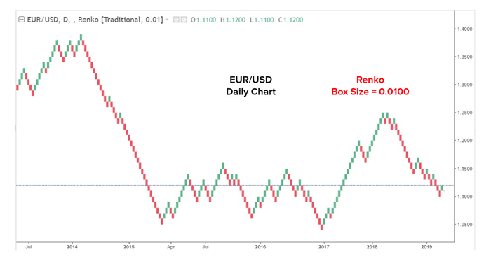
They are graphs that depend on the price side only, bypassing the horizontal axis of time, and the most famous of these methods are the Point and Figure method and the Renko Chart method,
in the sense that the graph does not show anything as long as the prices do not move by a specified amount. These methods of displaying quotes are characterized by relieving the technical analyst from all unimportant price movements that occur in the markets, and leaves him enough room to focus on important price movements.
The following figure represents a Renko chart for the Euro against the US Dollar, with a scale of 100 points per square, i.e. the graph only draws any price square when the price moves by 100 points.
The change in the graph structure does not include a change in the time axis only, as the price axis may also change, according to different price measurement methods, and there are two basic methods that are: -
- Arithmetic view
- Logarithmic view
Arithmetic view
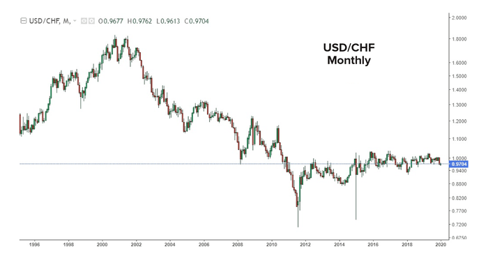
It is the bid method in which the distance between the units is equal.
The following example shows the price of the US Dollar \ Swiss Franc pair. In the price scale, the vertical axis, the scale is written so that each price point represents 0.1, and the distance between all the price units is equal.
Logarithmic view
It is the method of displaying the price, whereby the percentage of increase in the distance between the price units decreases as the price increases, so that the proportionality between the units is maintained, i.e. the distance between 1 to 2 Pounds is the same as the distance between 5 to 10 Pounds, so that each of the two changes equals 100%.
The following example shows the price of the US Dollar\ Swiss Franc pair. In the logarithmic price scale, the vertical axis, the scale is written so that each price point represents a different number according to the price movement.
Usually, the logarithmic scale is preferred for looking at long-term charts, so the technical analyst can look at a graph with a significant change in values over a large period of time.