
Chapter 3 - Introduction to charts
Lesson 3.2 - Time Frames for Charts
We have previously stated that the technical analysis principles can be applied to any time frame. It represents the most important advantages of technical analysis, but for further expansion, we must ask what time frame do we have to analyze?
To answer this question, we need to be well aware of the relationship between the price movement and the time movement from more than one aspect. The two most important aspects that must be clearly identified are: first, the charts time frames, and second, the time periods of the trend concept.
First: The timeframes for Charts
First of all, generally on the trading platforms, you will find that there are always time frames which are (month, week, day, four hour, hour, 30 minutes, 15 minutes, 5 minutes, 1 minute), and these timings represent the basic timings known to exist on all trading platforms.
However, developers of trading platforms have begun to develop trading platforms in a way that gives traders a little more space in setting timeframes more flexibly.
For example, in the MetaTrader 5 platform, one of the most popular trading platforms in the world, the producing company has developed the platform to include more time frames in terms of minutes and hours that were not available on many trading platforms.
The following figure shows different time frames, in minutes and hours, available for charts display.
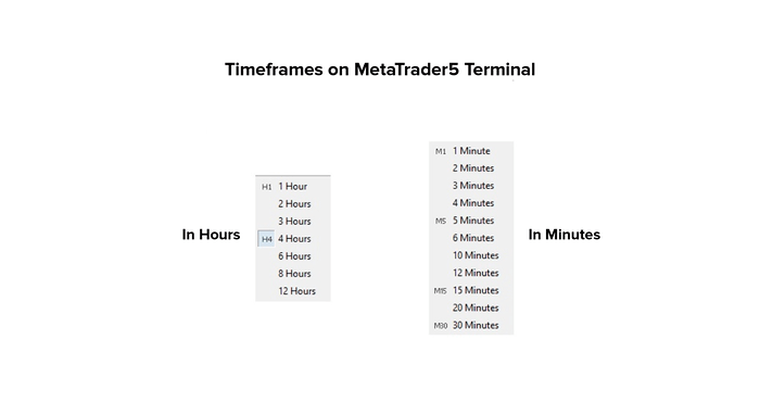
Traders may find special value for these time frames, as they give them the opportunity to read the markets better, but most of these times are not widely spread among analysts or traders.
Usually the weekly, daily, four-hourly, hourly, and 15-minute charts are the most widespread time frames among analysts and traders in most financial markets.
Second: The Price Movement. We have previously mentioned that the price movement can be drawn in several ways, and we will use the Japanese candlesticks as an example.
The relationship between price movement and time movement is represented in the sense that each unit of the graph represents a separate unit of time.
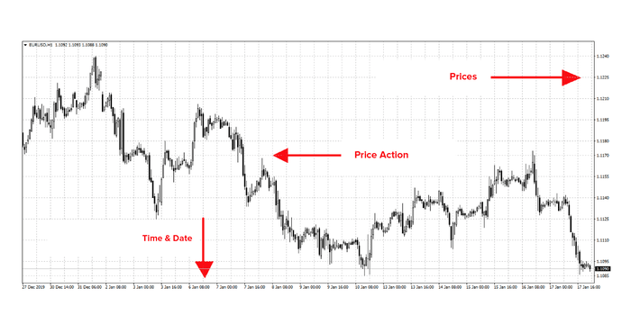
The next chart is the hourly chart for the EUR / USD pair.
This means that each price candlestick represents an entire hour of trading, and when the time frame changes, each candlestick represents a full time of the chosen time frame.
For example, if we adjust the time frame to display the same prices for the daily time frame, each candlestick will become a full day of trading.
Third: What is the Relationship between Different Time Frames?
There is a close correlation between the different time frames for displaying charts, and their recognition gives the technical analyst a great ability to estimate the different price positions. Clarifying the link between different time frames is a little complicated, but we will try to simplify it as possible.
In a very brief sense, we can say that the smaller time frames reveal more details compared to the larger time frame, i.e. they show prices in more detail.
If we look closely at the time frames, you will find that:
The monthly candles consists of 4 weekly candles.
The weekly candles consists of 5 daily candles.
The daily candles consists of 6 four-hourly candles.
Each four-hourly candle consists of 4 hourly candles.
Therefore, whenever the analyst wants to go into more price details, he has to go into lower time frames.
On the other hand, the larger timeframes are the sum of the lower timeframes, and they are characterized by that they reveal to the analyst a greater time period than the life of the financial instrument he analyzes,
for example,
The monthly candle consists of 20 daily candles. What if we have a graph that can display 108 price candles only, what is the period of time that the monthly chart will cover with only 108 candles? and what is the period of time that the daily chart will cover with only 108 candles?
You will find that the monthly graph will cover a time period up to 9 years, while the daily graph only covers approximately 5 months.
Therefore, large charts such as monthly and weekly charts are used to reveal a larger history of the financial instrument and are used for the purposes of long-term analysis, while the daily chart spares the analyst the large number of trading details on time frames less than one day.
Fourth: Time Periods of the Trend Concept
When defining technical analysis, we have explained the basic rules that underpin technical analysis, and we have shown that the markets are moving in directions, and this is a basic rule.
The word “trend” itself is divided into price movement and time. The price movement includes three sources of information (price, trading volume, open rights), while time represents three basic levels (long term, medium term, and long term).
Here, we will shed more light on the time periods of the trend concept, as the trends taken by the markets are perceived in a specific time period, so we may be guided by one of the most important theories of technical analysis, which is "Dow theory”, With regard to clarifying the term for each time period,
The long term runs from 3 months to several years.
The medium term ranges from 3 weeks to 3 months.
The short term runs from several hours to 3 weeks at most.
The long-term is the main trend, the medium-term represents the long-term correction, while the short-term represents fluctuations in the medium-term.
Dow theory arose from the study of stock markets and their indices. Dow believed that traders track the main (long-term) trend, and use the mid-term for timing purposes only, and the short-term is seen as insignificant.
The currency market is one of the futures markets, and it is characterized by the speed and intensity in executing transactions due to the nature of the contracts themselves, which makes it difficult for dealers and traders to follow the trends in the same logic as Dow.
As futures traders see the medium term as a primary trend and use the short-term trends to look for the entry signal. Long-term trends are not significant for trading purposes.
We have thus reviewed two aspects of the relationship between price and time, and the answer to the most important question remains, as a trader in the currency market, which charts should I analyze?
To answer this question, you have to define your goal of trading, as follows:
- Monthly and weekly charts: - They serve long-term purposes, where each price unit represents a month or a week. It is difficult to use these charts in serving trading purposes.
- Daily Charts: - They serve medium-term purposes, where each unit price represents a day. The price trends appearing on the daily charts are the most important for traders, and should not be broken during trading.
- Less than one day charts (four hours, hours, 30 minutes, 15 minutes, 5 minutes, 1 minutes): - They serve short-term trading objectives. They are used to define entry and exit points to be more accurate in terms of timing.
The technical analyst must realize the value of correlations between the different time frames, and how to use them in creating his vision. The trader must also know the correlation of time frames with each other, because it strongly affects the results of trading,
For example, what should a trader do if the short-term trend is bullish but the medium-term trend is bearish.